Checkboxes belong to the selection controls and are used to enable or disable functions. They allow the user to make a concious choice to use or not to use a specific function.
Use cases
With checkboxes we allow the user activate or deactivate a function.
Structure
Checkboxes are characterized by a checkbox icon, that is either enabled or disabled. The UI label is in any case on the right side of the checkbox.
Position
Checkboxes are positioned on a card together with further UI elements that relate to a specific function.
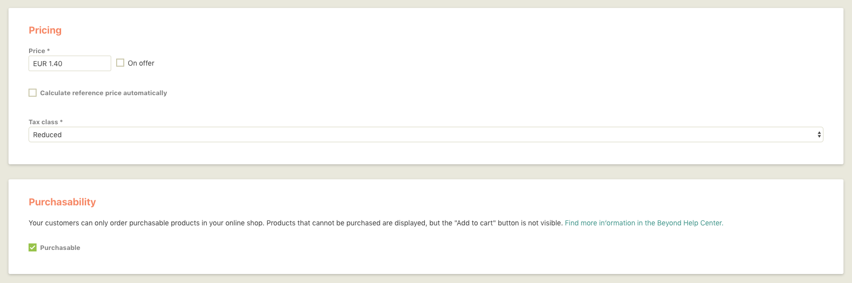
If a merchant enables a checkbox, the new function will appear below:
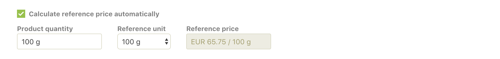
If the checkbox is to represent an extended function of a higher-level element, it is set at a close distance to this element. This emphasizes that the action of the checkbox refers to the previous element. In this example, the new function is displayed on the right:

Behavior
A checkbox can either have an enabled or disabled status, and can either activate or deactivate a function:
Or depending on the feature, further functions may appear:
Copy writing
- Reduced and efficient.
- Concise.
- Keep the UI label short and sweet.
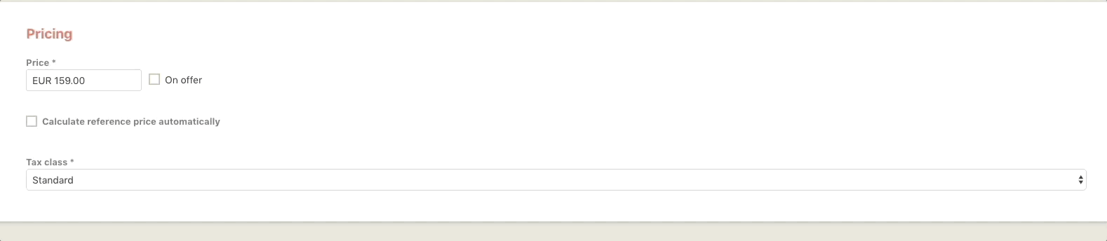
On offer
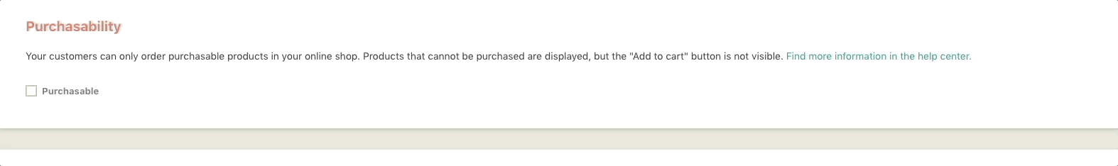
Purchasable
Filter by price
Avoid negations, as the merchant would have to select the checkbox for something not to happen:
Don’t send me more emails
Choosing between switch button and checkbox
For some actions, either a switch button or a checkbox might work. To decide which component would work better, here are some clues:
- Use a switch button for binary settings when actions become effective immediately after the user made them.
- Use a switch button if the feature has a significant effect on the users work and further work steps.
- Use checkboxes when the user can select multiple items that are related to a single setting or feature.
- Use checkboxes for optional or additional items.
- Use a checkbox when the user has to perform extra steps for changes to be effective.
Design
An enabled checkbox comes with a white checkmark icon on a green background, whereas a disabled checkbox is just a beige-outlined box.