Toast messages briefly provide feedback about an action through a short message. Merchants are quickly informed about important actions that they or the system performed.
Use cases
In the Beyond cockpit we provide three types of toast messages:
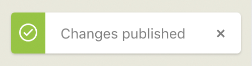
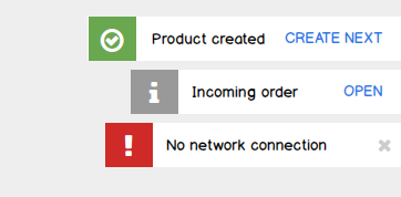
- Success. Appears if an action or operation was successfully completed.
- Information. Appears if an event occurred.
- Error. Appears in case of errors.
Structure
Toast messages are characterized by the following elements:
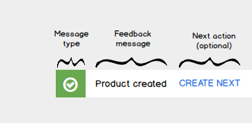
- an icon indicating the message type
- a short sentence stating the feedback for the merchant
- optional: the next action.
Position
Toast messages appear at the upper right corner of the screen.
Behavior
- Toast messages fly into the screen from the right side.
- Multiple toast messages are displayed one below the other.
Depending on the type of message, notifications disappear automatically or have to be actively closed by the merchant.
- Success messages automatically disappear after XX seconds.
- Information messages automatically disappear after XX seconds.
- Error messages are displayed until the error has been resolved.
Copy writing
Reduced and efficient.
- Concise. Keep the content short and sweet.
- Precise. Put your message in a nutshell.
- Neutral. Get the message across in a factual, but not emotional style.
Product created | Create next
Incoming order | View
No network connection
Exception: In case merchants have been through more complex configuration steps, reward them with a positive tone.
Congrats! Successfully connected with Google Shopping.
Design
A toast message is constructed as follows: icon - text - icon. Depending on the type of the message, the first icon can be either a white checkmark on a green background (success), the white letter “i” on a gray background, or a white exclamation mark on a red background. The icon is followed by a gray text section on white background, followed by a right-aligned gray “close” icon. In general, all three components are centered vertically.