A toggle switch works like a physical switch, that can be used e.g. to turn the light on and off. In the cockpit we display toggle switches to enable merchants to turn a feature or mode on or off, and to enhance cards with additional features.


The UI element “checkbox” is used in our software quite similarly. Check the section “Choosing between toggle switches and checkboxes” below and have a look at the inventory entry Checkboxes to find the right element for your use case.
Use cases
In the cockpit, toggle switches have three main use cases:
Activate or deactivate significant features
Some toggle switches in the cockpit have a significant impact on the functionality of the cockpit and the merchant’s workflow.
Example: Website settings
- Website is live: When the merchant activates this toggle and saves the changes, the website goes live and will be visible to customers. Customers will be able to view and interact with the merchant’s website.
- Allow visitors to make purchases on your website: When the merchant activates this toggle and saves the changes, a cart will be displayed at the top of the website and each product will have an “Add to cart” button, allowing visitors to order the merchant’s products.
💡 Note: This is a temporary solution. The current implementation needs to be reviewed and updated in the future.
Enhance cards with extensions
The cockpit is customizable. In order to allow merchants to adapt the cockpit to their needs, they can turn features on or off. This is possible, for example, on single cards.
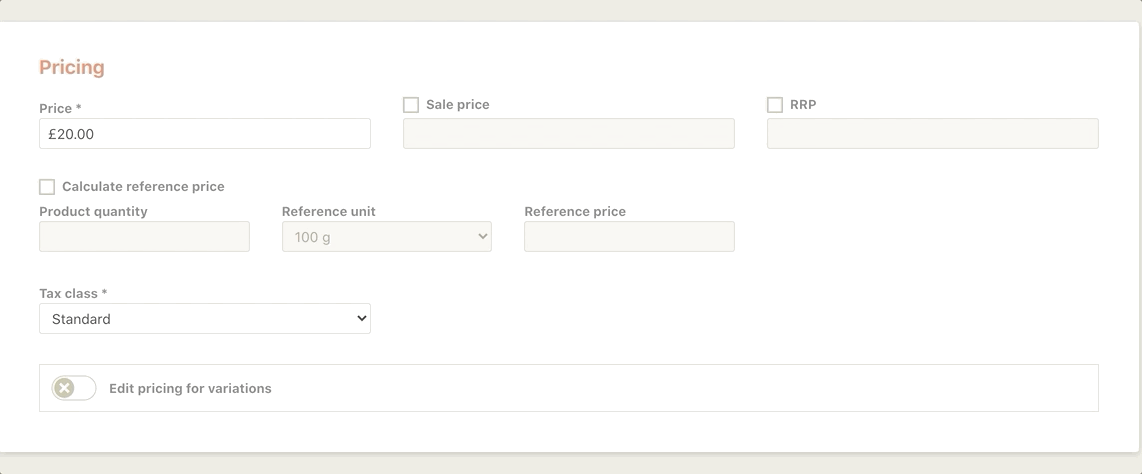
Example: Enable pricing for variations
For the pricing of variation products, the merchant has two options:
- If the toggle is disabled (default): The same price will be applied to all variations
- If the toggle is enabled: A table opens on the same card and allows the merchant to set an individual price for each variation.
Both options don’t have an impact on the functionality of the other cards, but enhance or reduce the functionality of the Pricing card only.
Switch between different modes
The third use case for toggle switches in our software is the activation/deactivation of different modes.
Example: Enable delete mode
On the Manage variations modal, the merchant can switch between two different modes:
- If the toggle is disabled (default): The modal is in the Edit mode and allows the merchant to make changes to existing variation values.
- If the toggle is enabled: The pen icons on the value bubbles change to x icons allowing the merchant to delete values. Also, a confirmation message pops up informing the merchant about the consequences of deleting a variation value.
Behavior
By selecting either the switch itself or its label, it changes its state:
Choosing between toggle switches and checkboxes
Toggle switches and checkboxes seem to be quite similar as they are both used to activate some sort of “settings”.
To decide when to use a toggle switch, here are some clues:
- Use a toggle switch to allow merchants to enable features that have a significant effect on their workflow.
- Use a toggle switch to enhance a card with additional content.
- Don’t use a toggle switch to activate small and distinct options, like an additional price field.
- Don’t use a toggle switch, when the merchant needs to select multiple items in a list that need to be saved afterwards.
Copy writing
As toggle switches typically allow merchants to enable or disable features or modes that have a significant effect on their workflow and data might be lost when they deactivate a previously activated feature, make sure the label (and description, if applicable) are precise and make it easy for the merchant to understand the consequences of activating/deactivating the toggle.
- Be short, precise and direct
- Start the toggle label with a verb and describe what changing its default state will do, e.g. “Allow visitors to make purchases on your website.” (exception: “Website is live”)
- If there is a static description text underneath the toggle, describe what will happen when the switch is activated. Start with “If this toggle is activated…”
- If the description text only appears after the feature is toggled on, describe what will happen when the switch is turned off. Start with: “If you toggle off FEATURE…”
- Don’t use neutral or ambiguous phrases.
- Avoid asking questions.
DO: (description) “If this toggle is activated, there will be a cart displayed in the header of your website as well as an “Add to cart” button on each product. Be sure to save any changes.”
Precisely explains what happens when the switch is turned on.
DON’T: (description) “A cart will be displayed in the header of your website.”
Too ambigous, unclear if this is what happens when the toggle is turned on or off.
ALSO DON’T: (neither for the description nor for the label) “Want to display a cart in the header of your website?”
The question format makes in unclear for the merchant if they need to activate or deactivate the toggle for the desired outcome.
Position
Toggle switches may be positioned on a card together with further UI elements that relate to a specific topic.
Design
A toggle switch looks like a classic on/off switch. The two different states give clear visual feedback so that the merchant is always aware if the toggle switch is turned on or off.
- A white checkmark icon on a green background, toggled to the right, represents an active feature or mode.
- A white cross on a beige background, toggled to the left, represents a deactivated feature or mode.
On the right side of the toggle switch, a label clearly explains the action that can be taken.
Depending on the complexity of the feature or mode, additional content may be shown below the toggle switch.

For further information on the exact visualization of additional content, consult the design team.