Web animations have become an essential part of the internet nowadays. If they are used correctly, they guide through the user interface, provide visual feedback to the user and simplify the handling of a website.
Let’s get started…
There are numerous ways to create web animations, for example with JavaScript libraries, GIFs, SVGs, and embedded videos. Here are a couple of reasons why especially SVGs are great for such web animations:
- They are supported by all modern browsers.
- SVGs are independent from the resolution and completely scalable. In contrast to other image formats, SVGs will look wonderfully sharp on any device with any screen size.
- They have a text-based format, which improves the accessibility and searchability of a website a lot.
- In contrast to raster graphic files, SVGs have a relatively small file size as the size does not automatically grow with the number of pixels, unlike, for example, for PNGs.
- SVGs are powerful because they can be manipulated with code. They can either be edited directly in the text editor or addressed with CSS and/or JavaScript. Animating with CSS is especially awesome because it doesn’t need extra libraries or alike. You only need some HTML and CSS to get rolling.
How to design and export the SVG
In the following tutorial, we’ll use Adobe Illustrator but the principles are basically the same for other similar applications. So, select your vector graphic tool of choice (e.g. Illustrator as well or other popular tools such as Sketch, Inkscape, or Figma). Feel free to use all sorts of strokes and shapes, different colors, and even gradients. All the information will be stored in the SVG code.
We start with a simple illustration – in this case a checkmark:
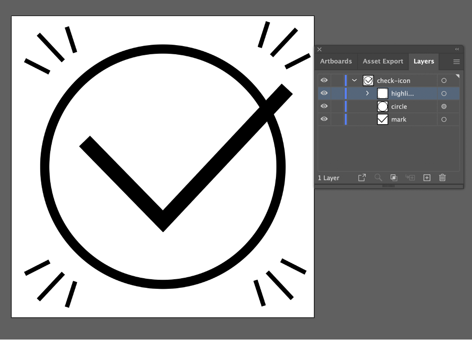
It’s recommended to group all the individual elements of the illustration that are related and supposed to be animated together. For example, in our tutorial, we group the highlight strokes. It also makes sense to name the elements and groups directly. Thus, you keep your file clean and it’s easy to remember which layer contains which elements as the layer names are automatically generated as IDs in the SVG code.
Before exporting your graphic, be sure that your illustration fits well within the bounding box to avoid rendering errors. In Illustrator, there’s an easy way to do this: Click on Object > Artboards > Fit to Artwork Bounds.

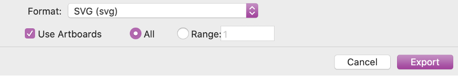
When your illustration is ready for export, go to: File > Export > Export As…
Then choose the format SVG. Check the option Use Artboards if you want, but be aware that Illustrator otherwise eventually crops the size of your graphic.
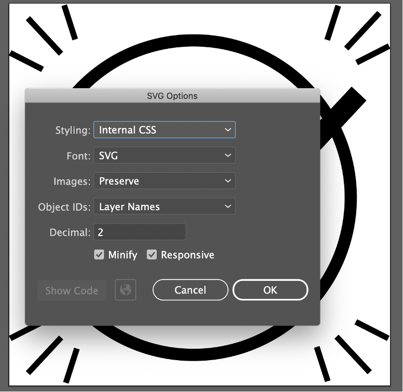
After clicking on Export, a new settings window will open. You can keep the default settings.
After finally exporting your illustration as an SVG, you can open it in a code editor and see the SVG code:

Now, you have the possibility to adjust the SVG directly in the code. You can customize classes and IDs according to your wishes or directly change the style rules. This is also a good way to edit SVGs that you didn’t create yourself.
Here’s a tip for optimizing your SVG after export: There are several tools that help you to keep your file as small and clean as possible, for example SVGO or SVG OMG. But be careful: When using such tools, you can over-optimize your SVG which could make it difficult to manipulate it with CSS later on.
How to animate your SVG with CSS
Now, let’s talk about how to bring your image to life. With CSS animations, we can implement simple but also cool animations that serve many use cases. Let’s try it out:
Once you’ve added your SVG or SVG code to a page, you have it in the DOM, which allows you to target and style your SVG with CSS like any other HTML element.
In our example, we just add a bit of CSS. As you can see, if we simply use the animation property in CSS with a bit of transform and opacity, we already have a cool and simple hover animation:
But as you can also see, there are some special characteristics in combination with the SVG. So, let’s take a closer look at two things that I think are necessary to animate SVGs successfully.
How to transform an SVG
Because of its own coordinate system, animating SVGs can be quite confusing, especially in the beginning. So, here is an overview of how to transform an SVG.
HTML elements have their coordinate system originating at the 50% point of the reference box. In contrast, without specifying anything else, the origin of each SVG coordinate system is in the upper left corner (0,0) of the parent element.
Let’s have a look at an example. In this SVG rotate origin, we have not specified anything else. We would expect the wheels to rotate around themselves. But as we can see, this does not work for an SVG, because the wheels rotate around the original zero point.
One thing that is important when speaking about SVGs is that there are multiple coordinate systems in use at once. That means when you create a new SVG element or use the transform property on an SVG element, you are generating a new “layer” for it. With the new layer you will have a “copy” of the coordinate system that is currently in use. You can also create a new viewport, acting in its own coordinate space, for those SVG elements.
But don’t worry - to realize simple animations, often only minor adjustments are needed to create the desired behavior. In our example, we only need two properties: transform-box and transform-origin.
Using the transform-box property, we can change the transform reference box of a specific element. Let’s focus on fill-box and view-box because they are specific to SVG elements. fill-box uses the object bounding box for reference, while view-box takes the nearest SVG viewport.
The second property is transform-origin. With this, we change the default origin and set another anchor point for an element’s transformation.
As you can see in our example, the wheels now behave as desired:
Please keep in mind that this is just an introduction to get started with SVG animations. So, forgive me if we don’t go into too much detail or if some things are broken down.
How to animate SVG strokes
Similar to the dashed value for borders in CSS, you can use the stroke-dasharray property for SVGs to create dashes in the stroke. A higher number increases the space between the strokes.
The stroke-dashoffset property defines along an SVG path where the stroke of a dashed line starts. Here, a higher number means that the strokes will start further along the path.
With these two properties and a simple animation, the magic begins! A dash can be as long as we want it to be and if it is longer than the path length, it looks like our shape is not dashed at all. If we now set an offset that is high enough, it looks like there is no shape. Now, we just need to set this offset back to 0 in an animation. And ta-da! It looks like the graphic is drawing itself:
Now you know the basics to easily and quickly animate an SVG with CSS. If you want to dive further and implement more complex animations, you can use JavaScript to enhance your animation or have a look at these JavaScript libraries that offer even more options:
About the author