I decided to exchange my university life with the working world for a while, and I am now doing an internship at ePages in Hamburg. I’d like to experience what it’s like to work in UX. When I began here last month, I got a very warm welcome, and I soon felt like a part of the company. Instead of just copying stuff and boiling coffee, I could already do a lot of different tasks on my own. What’s more, I was a part of various UX-related meetings from my first day on.
My little diary of creating an online shop
One of my first tasks in the UX team was a Diary Study. According to the Nielsen Norman Group it is a qualitative usability research method that can give insights about user behaviors and needs. In this case, I slipped into the role of a merchant who sets up an online shop for the first time. I noted down what I did in the first 10 minutes, and also every little issue that I came across: not knowing how to do something, everything that doesn’t work like I would expect it, an unexpected step in the workflow, a function that I miss… .
Welcome to my fabrics shop
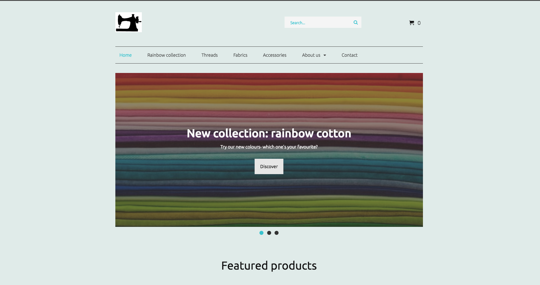
As I am very passionate about sewing, I created a shop to sell fabrics, “lucky bags” (little scraps of fabric), and some accessories, such as scissors.
It was fun to prepare a product range and to think of how to present my shop in a nice way. I could also see how my storefront would look like later, and I did a test purchase to see how everything works. I even invented marketing strategies like coupons and Call-To-Action buttons to present new products, and link to their specific product pages.
What I came across
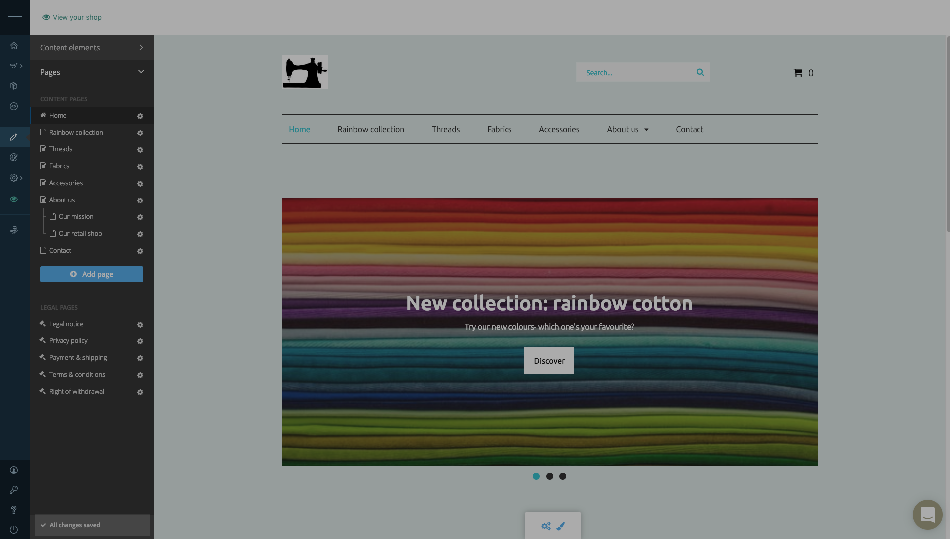
One issue that I noticed when working in the Editor concerns the saving process. While editing my pages I didn’t get any indication whether my work is saved automatically or if I should save it on my own. (I was already used to Save buttons and toast messages when setting up my product range.) Only after talking about this issue later on I discovered that actually a confirmation message already exists to indicate that the changes are saved.
It is just bit hidden in the left corner:
Never stop improving
After completing the Diary Study, I turned it into a list of UX issues and presented it to the Product Management team. They were curious about what can be improved. As a newbie in creating an online shop I brought a new perspective on the product which helped to discover several issues. For example, I could tell Product Management if the descriptions and help center articles helped me during the shop setup. I also advised them where a tooltip or another description might simplify some things.
Next up
For me it was the perfect task to actually get to know the software, and also to get an intuition for UX-issues. So now, whenever my colleagues are in a discussion about the product I know what they are talking about, and often I can give input from my experience as a user.
As a next task I will examine the onboarding process of the merchant, and check what can be improved. My Diary Study is the ideal basis because I already know some issues, and I can rely on my experience. And the best: I know how a merchant might feel when creating an online shop with our software, which is a crucial part of working on the User Experience.
Conclusion
The Diary Study was the perfect task for me. I learned a lot about online shop software and the perspective of a merchant. It was a lot of fun to set up everything, and to create my own shop. And what’s more, I helped ePages to discover some UX issues, and improve the product.


