As UX experts, we work with different tools to ensure an efficient working routine. We organize our work with tools. We need tools to complete certain tasks. And sometimes they just make our lives so much easier 😉.
You see, UX tools have quite an importance in my daily work.
That’s why I decided to share my favourite tools with you, and explain you in which UX phases, and for which use cases you can use them.
With this first post, I’ll jump right into the first UX phase.
Every good UX concept starts with user research, competitor analysis, and basic UX groundwork.
Depending on the concept scope, we have different tools that can be of help:
Kanban board in Jira
Let’s start with one tool that is not exclusively for UX, but makes the organisation of our work much easier, and really efficient. I don’t want to miss it anymore: the Kanban board in Jira. It turned out that the statuses “To do”, “On hold”, “In progress”, “Review”, and “Done” work best for our work process. And we have a backlog that contains further tasks yet to come.
Every week we have a planning together with our Technical Communicators, and our Scrum Master. Beforehand, the Product Owners of every development team submit us tasks that need to be done in the next week, e.g. if an implementation starts soon. Together with this list and our backlog, we plan the upcoming week. A major part of our work is supporting development, and therefore, talking to developers, and product managers - planning the week is a though job… You’ll never know the amount of support talks we will have in a week. That’s why we decided to have a dedicated planning, but also to drag tasks from the backlog. To be honest, it happens more often that one or the other task remains in the “To do” column. And here lies the strength of the board: a task never gets lost, and everyone in the process is informed about the current status.
So if you also have to work with a lot of different teams, and need to prioritize a lot of tasks, I recommend you to try out a Jira board that is public to your stakeholders.
Polldaddy, SurveyMonkey, and Typeform
Polldaddy is our company tool to run surveys. It has a rather basic feature set, but you can easily conduct simple surveys to get quantitative (and qualitative) feedback from users. Conducting surveys is especially helpful, if you already have a broad understanding on the users’ requirements and want to collect a high number of answers to confirm your assumptions. Moreover, surveys are a great way to get feedback on different features.
Although we mainly use Polldaddy to conduct surveys, I recommend you to have a look into SurveyMonkey. It is great for complex surveys with the need of logical links, and it has a good integrated tool to analyze the results. For small surveys, I like to use Typeform, as it has a really modern looking, and appealing design. Small surveys are quickly done, and look awesome on mobile devices.
Recording device
A recording device may sound a little old-fashioned, but it is a great tool to accompany field studies, such as qualitative interviews or contextual inquiries. If you record your interviews, you can easily write a protocol or transcript when you are back in the office. You don’t need to note down every single information, and can instead concentrate on the interactions and the answers from your interview partner. This increases the quality of the talk. And if you move the recording device out of the participants’ view, it’s quickly forgotten. For our studies we always have a dedicated recording device, and don’t use a mobile phone. It feels less obtrusive and more professional.
Post-its and index cards
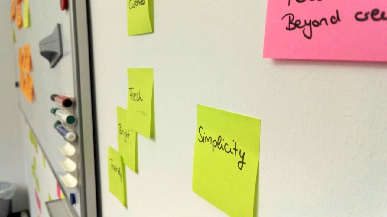
In our UX team, we love post-its and index cards. We have several use cases for them, and most of the time our walls are full of post-its. Although I feel a little guilty about all those trees that had to die, it’s often very valuable to visualize user flows and ideas on paper. It helps to get a better overview on complex structures, and to discuss approaches with the team. As you can easily restructure post-its and write new ones, we use them almost in our whole UX process.
Some of our major uses cases are listed below:
- Brainstorming (e.g. structure new ideas)
- User flows (e.g. how should the fist onboarding session look like)
- Cardsorting (e.g. build an information architecture)
- Notes during usability tests (e.g. write down first observations and obstacles)
Of course there are also digital ways to do e.g. a cardsorting. OptimalSort comes to mind. Compared to paper index cards, it has the advantage that users at other locations can contribute. What’s more, it’s easier to analyze, when you have a high number of participants. However, for a simple start we always prefer the good old index cards.
Whiteboard
Last but not least: the whiteboard! We have whiteboards in almost every office. Sometimes it only serves as an adhesive surface for our post-its, but often it is the center of our discussions. Especially in the first groundwork phase it’s great to scribble ideas on the wall to explain them e.g. to product management. Also our product managers love to draw their ideas or expected user flows on the whiteboard. Afterwards we can use the scribbles and notes to start our UX concepts.
That’s it. These tools are my personal favourites for user rearch and UX groundwork. You haven’t had enough? Then be curious about my next post about UX tools for the concept phase.


