According to the Cambridge Dictionary, the term “onboarding” refers to “the process in which new employees gain the knowledge and skills they need to become effective members of an organization”. However, the term “onboarding” can also be applied to the process by which new customers are introduced to a software. Here at ePages, we intend to create great and easy-to-use products. We accept the challenge and want to enable all (potential) merchants to open their own online shop - without any programming knowledge or technical affinity.
One of the topics that we are currently working on is the “onboarding” – only one little word, but of great importance and with a wide range of facets.
Onboarding within our ecommerce software
Once customers have registered for a shop, one part of the onboarding process is to show them the steps they need to go through before their shop can go online. For this, we offer different features that are supposed to support the merchant right from the start, such as
- a dashboard that shows the relevant steps to get started (e.g. adding products, setting up the storefront, taking care of legal issues),
- onboarding tours that introduce merchants to the shop’s administration,
- video tutorials,
- help sections where merchants can find many explanations regarding different settings and features,
- and more.
The more the better?
Looks like a great bouquet of options. But is it really necessary to offer such a wide range of tools? To improve our onboarding process for merchants, we conducted a workshop evaluating the current onboarding tools, and gathered further merchant feedback. With that, we found out that many of our merchants do not necessarily want to get into different tools, but would rather be guided through a minimalistic “easy and intuitive setup process” – whatever that means.
From the UX point of view, this is not surprising since everything is new, especially for new users who are exploring the online shop for the first time. Only a reduction of the cognitive load can help to not overwhelm the merchant and make the task seem manageable.
However, additional guidance or other tools should not be used to fix problems caused by the insufficient usability of a software. Instead, onboarding can be strongly supported by sticking to design guidelines throughout the platform, while the number of additional tools needed is reduced.
Good design needs no explanation
Even though good design needs no explanation, it can still follow some guidelines. Therefore, we will have a look at some of them in the following section and outline the most important takeaways for an onboarding process.
Dialogue principles
Standards like the dialogue principles (as stated in ISO 9241-110) provide helpful guidance for setting up an interface. Especially for the onboarding process, everyone involved in the development process can ask themselves questions such as:
- Do we use terms that the user can easily understand (self-descriptiveness)?
- Are the necessary steps appropriate for the task?
- Does the system support learning (e.g. through tooltips or undo and redo)?
If one of the answers is “no”, we must try to find a way to improve our solution before we start explaining it.

Usability heuristics
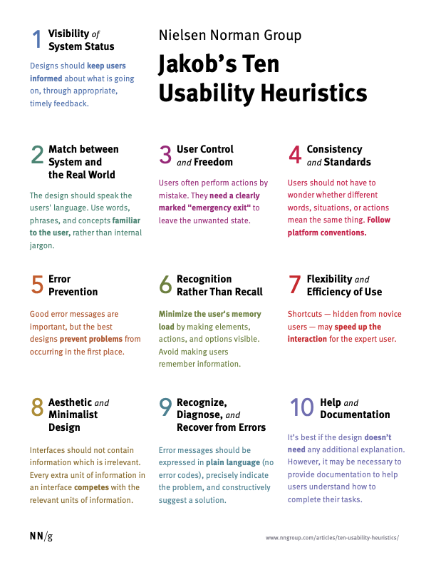
Additionally, the consideration of Nielsen’s Usability Heuristics can be helpful, as these guidelines for setting up interactive systems also relate to the dialogue principles but are even more specific. It is worth taking a closer look – the Nielsen Norman Group website also provides short videos presenting the key messages of the heuristics.
To start with, you should pick out a few of them, namely…
#1 Visibility of system status
The design should always keep users informed about what is going on, by providing adequate feedback within a reasonable time period.
#6 Recognition rather than recall
The user should not have to remember information from one part of the interface to another. Information required to use the software (e.g. field labels or menu items) should be visible or easily retrievable when needed.
#8 Aesthetic and minimalistic design
Interfaces should only contain elements and information that is required for the current situation. If the interface includes additional or maybe even irrelevant information, users might have a hard time figuring out what is actually important for them and their desired action.
What we can learn from heuristics for onboarding
Especially in the beginning, the user is likely to be overwhelmed because they discover a multitude of information and do not yet know what is relevant for them and what is not. To save them from this dilemma, the system should offer guidance and reduce the cognitive load instead of just saying “Hello”.
Guide them through the steps necessary to set up a shop.
- It must be clearly indicated which steps are necessary and what to do next.
- In addition, it is important to inform the user about the system status, such as feedback on the steps that have already been completed. This information also has the pleasing effect of increasing motivation and engagement through rewards – which can be a “done-check” or some other, perhaps more specific type of appreciation.
- Being guided through the software step by step will teach the user how to use it. Thus, the user learns something without even noticing that they are learning something new.
Reducing cognitive load by getting rid of unnecessary information.
Every time users go through a tutorial, they have to remember the things they have learned up to the time they need them. What if they don’t?
- Presenting them with the information they need (and no more than that) while they are working on a task reduces the cognitive load. So, the relevant information must be revealed step by step – always where it is needed. Showing no more is the idea of #8 of the usability heuristics “Aesthetic and minimalist design”.
- Offer help within their context is of more value than interrupting the user’s work by leading them to an extra help section.
- Reduce complexity by showing instead of telling because less text means less complexity.
How to continue
Setting up an online shop is a complex task. Our products are continuously growing as more and more features are offered to the merchants. Nevertheless, our mission statement remains the same: Simplicity is beautiful. That’s why we take this as a challenge to provide a simple and user-friendly way to set up an online shop - keeping all of the above in mind. Maybe this might even end up in a reduced bouquet of onboarding options, but more in-context help. But as you might have guessed, there is no “one-size fits all solution”. We’ll see what works best for our users - and so should you.