Today designers have millions of different fonts to choose from. And the ambition to find a suitable one for their project runs in their blood, so to speak. In the early 80s, after letterpress was replaced by offset printing, many typesetters switched to phototypesetting and later to a computer workplace and digital typesetting. You could say that the typesetter is thus the forerunner of the digital and print media designer.
So, here we are a couple of decades later, having the opportunity to choose from countless font-families. But how do we choose between all the possibilities?
Let’s make the most of this variety before another font ends up like the frowned upon Comic Sans MS. In this post, I will share a few of my favorite serif, sans-serif, and handwritten fonts.
Serif Fonts
Serif fonts are often dismissed as unfashionable especially by web designers as they are a reminder of the old school physical book pages. And although I would not want to use serif fonts on their own, partner them with a plain sans serif font and you got me.
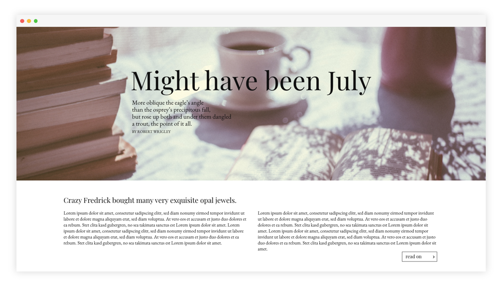
Playfair Display
This font, designed by Claus Eggers Sørensen, is a little bit, as the name announces it, more playful than typical serif fonts. The serifs partially finish with a dot which makes the whole picture not as straight as most serif fonts are. However, each letter, particularly the lower case ones, have a relatively large height which makes the typeface appear somewhat elegant. Playfair Display comes in 12 styles making it easy to emphasize without using another font-family - although you could, since Playfair Display can be paired with most plain sans-serif fonts like Roboto or Open Sans but also with other serif fonts. Furthermore, it is very well suited as a headline.
EB Garamond
EB Garamond is the revival of Claude Garamont’s famous typefaces from the mid-16th century. An ode to a key moment in history and a free and open-source community project. Although I personally think that a designer would not use this font on a regular basis, it can fit to certain occasions. It comes with a seriousness that can be instrumentalized. EB Garamond may be best suited for printworks but it can also be used for the body text of a website. I would not use it as a headline though, since the typeface works best for smaller text sizes. In the example below, I thus paired it with Playfair Display.
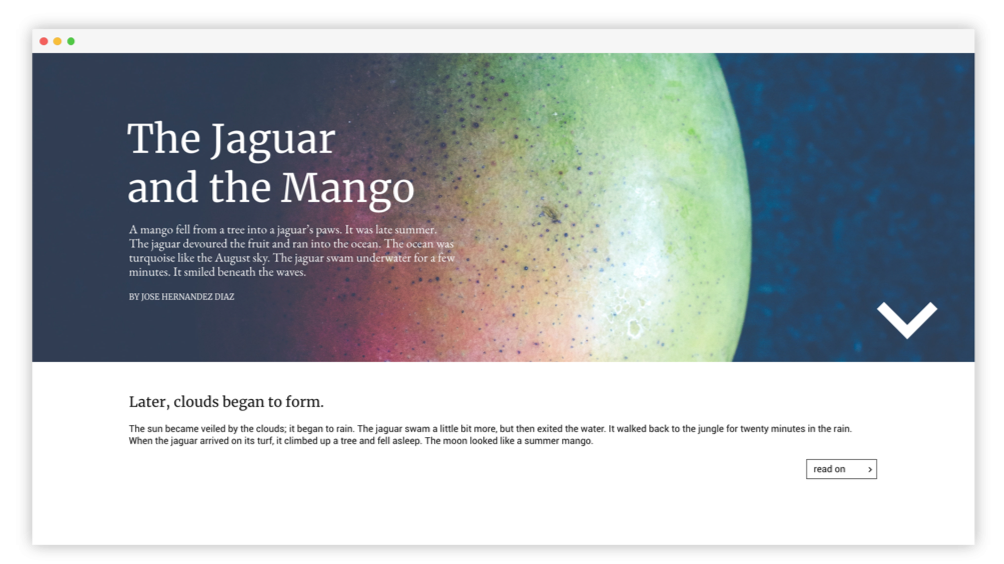
Merriweather
Merriweather was designed by Sorkin Type for screens. It is a very pleasant to read typeface. The font has a certain slab serif look and feel to it as it has block-like serifs. It looks slightly similar to Roboto Slab but it is somewhat more elegant since it does not have the typewriter appearance to it as many typical slab serif fonts do. Also, it stands good on its own as you can see beneath. Like with many serif typefaces, you can also pair it with a sans serif font-family (here: Roboto).
Sans Serif Fonts
There are countless sans serif fonts out there in the web. And to be honest, many of them look good and most of the time, they differ in just a few characteristics. They are ideal for websites, since they look more modern than serif fonts. Here are a few of my favorites:
Roboto
The classic among the Google Fonts, Roboto by designer Christian Robertson, is largely geometrical and has a clear static look to it. It has 12 different styles to emphasize. You can’t go wrong with this font.
Quicksand
With its distinctive round terminals, Quicksand by Andrew Paglinawan is easily recognized. It is best used for display purposes. Quicksand looks modern and young but has a slightly playful character, so I would not recommend this font to professional corporations but rather for blogs or smaller, one-person businesses to emphasize on the personality behind the website.
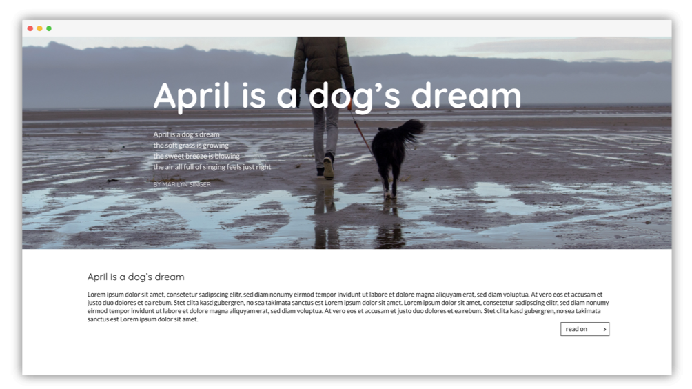
Montserrat
This font was designed by Julieta Ulanovsky to celebrate the beauty of urban typography. Although it works best for headlines, you can use it as a body text font. The slight horizontal stretch of each letter of this typeface gives it a futuristic and modern look. It comes in 18 (!) styles and works good on its own.

Handwritten Fonts
However beautiful they may look, a designer needs to be attentive when using handwritten fonts. Too much of them and a website looks messy and not well thought-through. Also, it’s not the best idea to write your body text in handwriting as most of the time they are just pretty and not pretty to read. Nevertheless, there are many beautiful handwritten fonts out there and given the right context, a designer can make beautiful pieces of art with it.
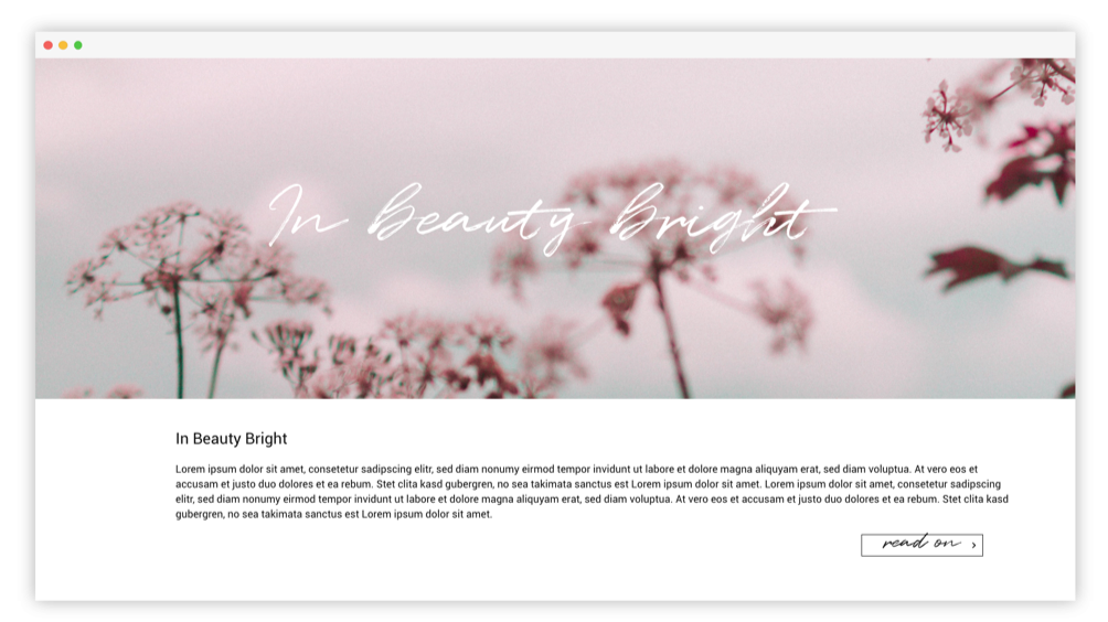
Dancing Script
All of the above typefaces are Google Fonts, free and open-source. They are a great resource from designers for designers. However, when it comes to handwriting fonts, I personally think that there are better ones out there. Dancing Script by Impallari Type is, as the name announces it, spontaneous and the letters bounce. Still, it looks kind of intentional which I think should not be the case with handwritten fonts. Either way, if it fits to the content of your creation, it is a good choice to shaken up your design.
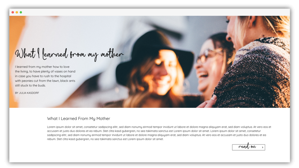
Wildy Sign
This premium handdrawn monoline font by Dikas Studios looks really realistic. The letters flow into each other and catch the eye of its viewer immediately. Wildy Sign works best for print designs or social media feeds, but I can also imagine it on a website to emphasize the personality of its owner. In the example below, I paired it with the above mentioned Quicksand.
Quentin
A bit difficult to read but nontheless beautiful. That’s Quentin by Get Studio. This free typeface is an eyecatcher. Its significant rough texture from dry strokes look really authentic. I can imagine it on a website with an artistic topic. It can be paired with many fonts but I would recommend using a plain and simple sans serif font like Roboto.
As I said before, it is really difficult to choose from this grand variety of fonts. The above mentioned fonts are just a glimpse and a few of my all-time favorites.
About the author